Mountain Dew Green Label Art
Limited Edition Artist Series Aluminum Bottles
“Back in 2007, Mountain Dew started its Green Label Art program with a series of limited edition designs created by graffiti, tattoo, graphic, stencil, and collage artists. The artists were provided with a blank aluminum 16-ounce bottle, and were asked to use it as a canvas to create a Dew-inspired design with their different mediums and styles.”
Collection Notes
Release parties were held alongside art shows, and the artists incorporated their design into other mediums as well (like bicycles or sneakers). Fun fact - this series marks the first time a carbonated soft drink was packaged in an aluminum bottle in the US.
It's difficult to find information about these bottles online. I gathered what I could from old press releases, eBay listings, photos of event material, and artist pages buried in the archives of the old Green Label Art sites. Shout out to the ABC Chapter of the Brewery Collectibles Club of America for being a valuable resource here as well.
In all, there appear to be 32 bottles in the Limited Edition Artist Series. I'm confident that this list is complete. Note that two are considered “chase” bottles: “The Course Marker”, which was used as a promotional bottle to hand out at events and was not available retail, and “Circle of 8”, which was released in low quantities and not advertised.
Three of the designs from Volume I are re-issues from 2007. The original bottles can be differentiated by the lack of a small white rectangle containing a code next to the UPC.
A handful of promo/test/prototype bottles exist that were not released publicly and are not counted here.
A number of similar bottles were released by Mountain Dew around this time: a Halo 3 bottle, 4 part NASCAR series and 4 part Stars and Stripes series. These are not part of the Green Label Art collection (although they are frequently listed as such).
Volumes I and II (maybe others?) were available in triangular acrylic “VIP” display cases featuring inserts with artist and design information. These could be found at events or were sent to certain individuals.
Green Label Art continued involvement in the art scene after 2009, but didn't release much to supermarket consumers. In 2010 there was a “Shop Series” contest, the winner of which had their design featured nationwide on a normal sized can.
In 2013 Green Label Art combined with other Mountain Dew programs to create a digital hub for youth culture called “Green Label” that has since been phased out. It seems unlikely that this promotion will be rebooted, but here's hoping!

Series 2007
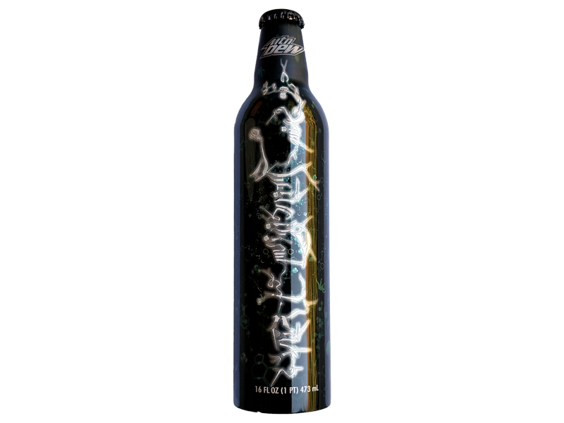
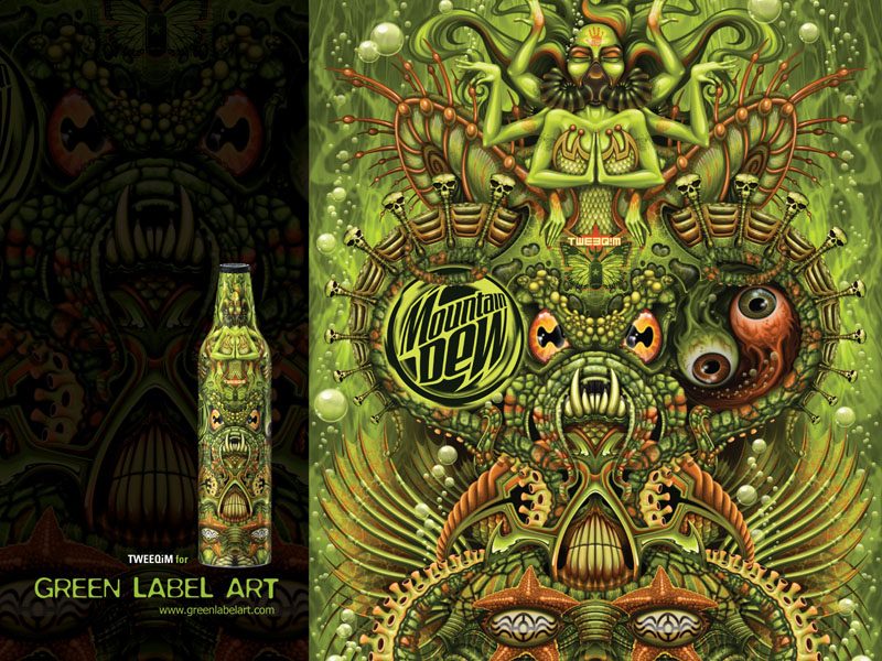
TWEEQiM, “Dew Lords of the Deep”
“What if Mountain Dew was sourced from a mysterious uncharted land or planet? What would one find if they were to brave the deeps of that source? Lost civilizations? Relics? Liquids dwelling from creatures and totems worshiped - or feared?”TWEEQiM (Portland, OR)
TWEEQiM is the design studio of husband and wife creative duo miQ willmOtt and THUY3. miQ made an early name for himself creating art for Guns 'N Roses, The Ramones, The Black Crowes and Skinny Puppy. THUY3 got her start working in the entertainment and toy industries, sharpening her skills in painting, digital art and the kustom kulture. THUY3 and miQ came together at their corporate art gigs- miQ as the art director for Hot Wheels and THUY3 as graphic designer for Barbie and Matchbox. They soon collaborated on mixed media, painting and custom designer toys. TWEEQiM's elaborate and illustrative approach to their work is why Dew approached them for the Green Label Art project.
Chris Pastras with Paul Rodriguez, “Pharaohs of Dew”
“The design came from Paul's head and my pre-existing work. I'll ask a guy what he wants, then interpret his ideas into my style.”Chris Pastras (Los Angeles, CA)
Chris Pastras emanates natural creativity. Stemming from his Noside Banks skate roots and extending throughout his dynamic visual art, Chris maintains a unique perception of fluid style and progressive technique. Aware of these qualities, fellow skater and Dew athlete Paul Rodriguez didn't think twice before inviting Chris to participate in a true collaboration of skate and art. During a 72-hour brainstorming session between these two skate icons, various design concepts were thoughtfully sketched. Paul's lifelong aspiration to visit Egypt kept showing up in design ideas, and their creative alliance evoked “Pharaohs of Dew.” The Pastras-Rodriguez partnership is an archetype of cultural object d'art.

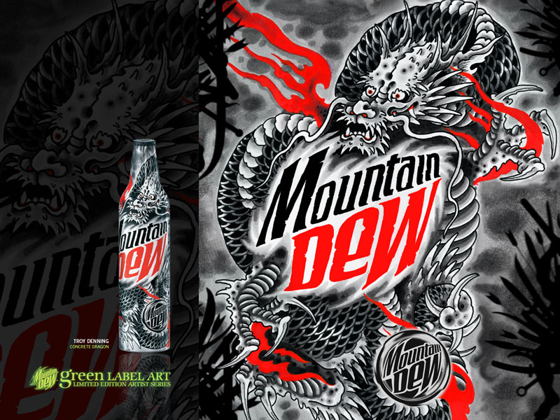
Troy Denning, “Concrete Dragon”
“I wanted to make my bottle look like a magic elixir from a samurai's medicine pouch. Something to get him through battle.”Troy Denning (New York, NY)
Troy Denning has 19 solid years of tattooing experience under his belt. Having studied extensively in Europe and Japan, Troy has learned from the best in the industry. With an undeniable passion for his work and the craft of tattooing, it was only a short time before Dew found out about Troy and his Lower East Side fusion studio and gallery, Invisible NYC. With a bivrant and crisp style that pays respect to the Japanese Irezumi, Troy and his studio are big supporters of NYC's tattoo and contemporary art communities.
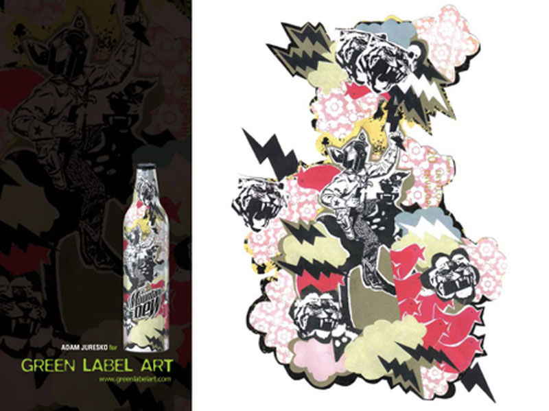
Adam Juresko, “Paper Tigers”
“I've been using tigers, because, like sharks, I'm terrified of them. I'd like to think that by using their images, little by little, I'll become accustomed to them. Then one day, if I ever come across one, I'll be able to pet it.”Adam Juresko (Richmond, VI)
Adam Juresko makes his art almost entirely from cut-n-paste mixed media. It's not a graphics program, but rather a technique that involves literally cutting and pasting with scissors and glue, newsprint type, wallpaper, his own drawings or whatever he can get his hands on. Dew chose Adam to be a part of this project because of his raw, simplistic approach to creativity and design. When Dew ran into trouble downloading his art files for his bottle design, he referred us to a friend who scanned the collage for him. Adam explained: “Sorry, I have no idea how to use a computer.”
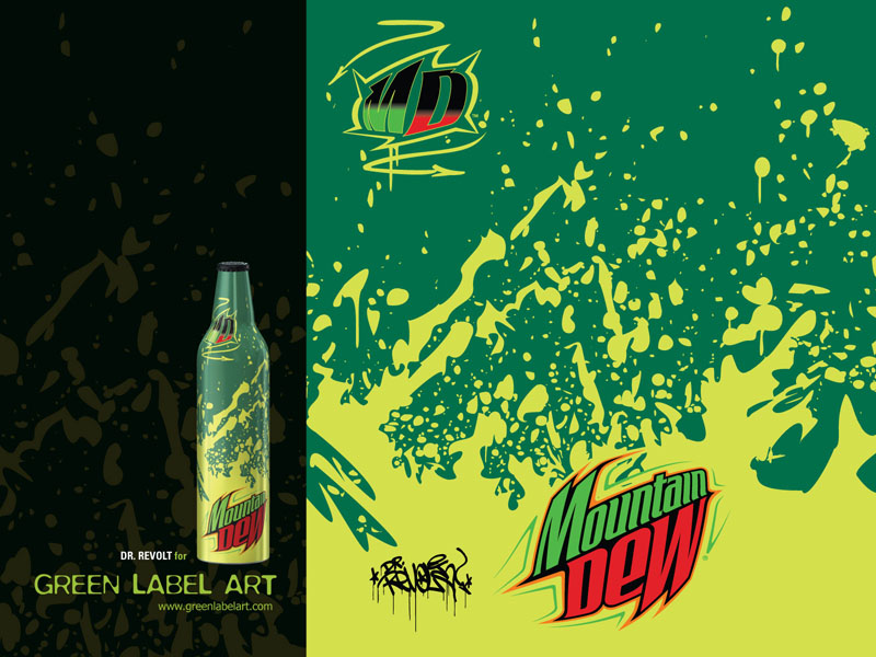
Dr. Revolt, “Splish Splash”
“I love the so-almost fluorescent color. And I just wanted to be splashin' that yellow-green dew around like an 'urban hillbilly' gone wild!!!”Dr. Revolt (New York, NY)
Dr. Revolt began his practice in 1977 as an original member of the historic New York City graffiti crew, The Rolling Thunder Writers (RTW). Dr. Revolt became known for doing both tags and elaborate, colorful murals with psychedelic and comic-art influence on the Broadway No. 1 subway line. His artwork has been featured in classic hip-hop films such as “Wild Style” and “Style Wars”. These days, NYC subways are graf free — but Revolt shows his work internationally, in art scenes as diverse as Baltimore and Paris. He was approached to participate in this project as Dew's aluminum bottle provided the perfect canvas for his colorful expressions.
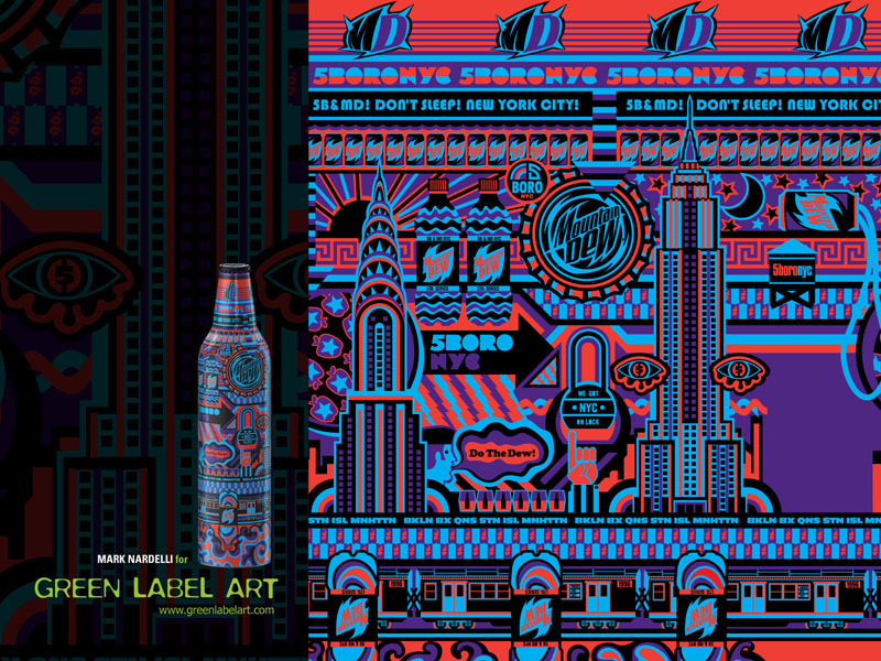
Mark Nardelli with 5Boro, “Don't Sleep”
“DON'T SLEEP was inspired from the 60's rock posters and the concept of Dew's energy powering the many layers of NYC's nonstop infrastructure.”Mark Nardelli (New York, NY)
Mark Nardelli, graphic designer for 5Boro Skateboards, has been a NYC skate scene local since the early '90s. Open for business 24-7 like the city itself, he keeps his lights and laptop on round the clock. “You must have fun during the process of any project,” says Nardelli, “this can be blowing out a pair of desk speakers, skating in the office or settling down for a focused work session.” For both 5Boro and personal work, Nardelli looks to the handmade aesthetic of letterpress type, imperfect textures and references with a crude character. His inspiration comes from the bold flair of early '60s protest and rock posters; he's always had an eye for graphic treatments and color, long before the era of computer graphics.
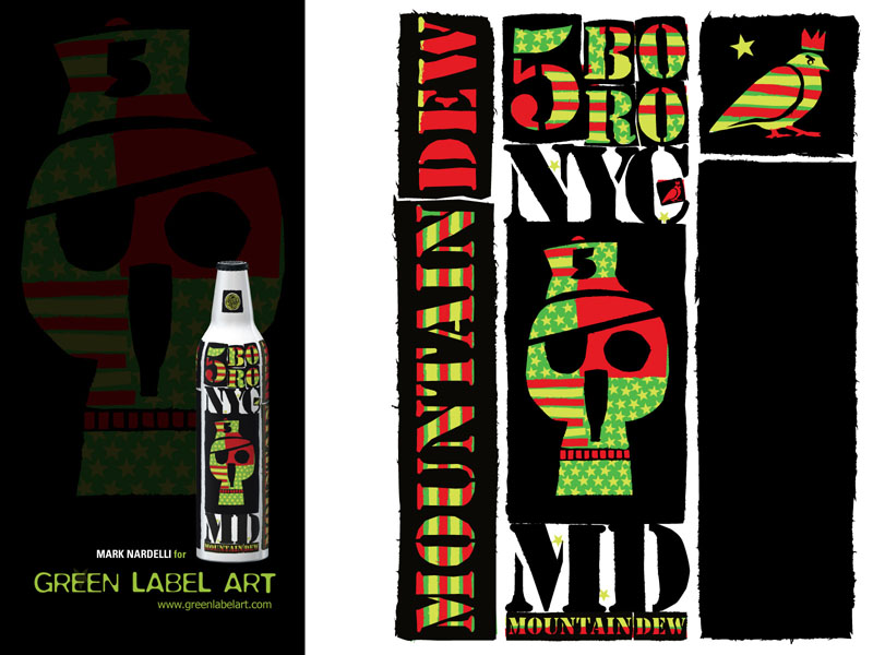
Mark Nardelli with 5Boro, “Pop Art Pirate”
“POP ART PIRATE was inspired from 60's anti-war posters mixing crudely cut stencil type with iconic images including a Dew bottle for the nose of the skull. They eye patch and the 'PA Pirate' Baseball hat were traits taken from 5Boro pro rider Dan Pensyl.”Mark Nardelli (New York, NY)
Mark Nardelli, graphic designer for 5Boro Skateboards, has been a NYC skate scene local since the early '90s. Open for business 24-7 like the city itself, he keeps his lights and laptop on round the clock. “You must have fun during the process of any project,” says Nardelli, “this can be blowing out a pair of desk speakers, skating in the office or settling down for a focused work session.” For both 5Boro and personal work, Nardelli looks to the handmade aesthetic of letterpress type, imperfect textures and references with a crude character. His inspiration comes from the bold flair of early '60s protest and rock posters; he's always had an eye for graphic treatments and color, long before the era of computer graphics.
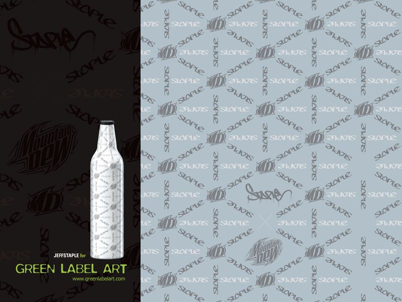
jeffstaple, “Staple X”
“2007 is Staple's 10th Anniversary. Coincidentally, the traditional gift for a 10th anniversary is aluminum or tin; so the bottle in its existing form was a perfect canvas. I wanted to create a simple and elegant design that enhances the qualities of the bottle itself.”jeffstaple (New York, NY)
Jeff Ng, aka jeffstaple, has masterfully created a unique perspective for communication through his company Staple Design. From his headquarters at his boutique, The Reed Space, Jeff and his creative associates produce Staple clothing as well as projects for everyone from Burton to Apple. 2007 is an important year for Jeff — he's just opened The Reed Space store in Japan, and is also celebrating 10-years of Staple Design. As part of the 10-year celebration, Staple Design is issuing many limited edition items, including his Dew bottle design.
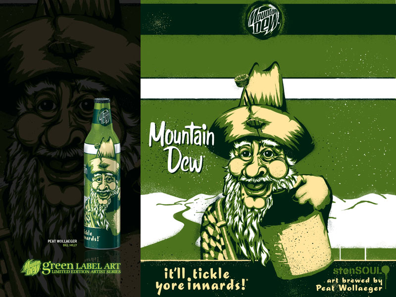
Peat Wollaeger, “Bill Hilly”
“Too much exposure to spray paint fumes and a vintage bottle of Mountain Dew.”Peat Wollaeger (St. Louis, MI)
Peat started doing urban-influenced graphics in the early 90's. After seeing the works of guerrilla artist Banksy, he was inspired to try stencils and spray paint to reproduce his illustrations. Now stenciling is his medium of choice because they “look the best on the street.” Dew became interested in Peat after seeing his imaginative viral videos in which he portrays his stencil characters in costume. Check out the video of his rendition of the retro Dew character Bill Hilly at www.greenlabelart.com
Methamphibian, “Tundra”
“The idea for the bottle concept comes from the amalgamation of recurring themes found in my current designs: dark, alluring, seductive woman's face juxtaposed onto a contrasting drab, military-inspired camouflage background. It's all about bringing polar opposites together, not only in the design itself, but the introverted nature of the artwork is mated with the extroverted identity of Mountain Dew.”Methamphibian (Los Angeles, CA)
An elusive character in the world of art and design, Peter Kim created Methamphibian as a pseudonym and ongoing creative endeavor encompassing illustration, sneaker customization and apparel. With a design philosophy centering on DIY principles — a pillar of the Green Label Art project — Methamphibian's collaborations with brands like DC Shoes introduced Dew to the artist. His focus on individuality made him a perfect match for this project, where he takes an introverted approach to Dew's extroverted persona.

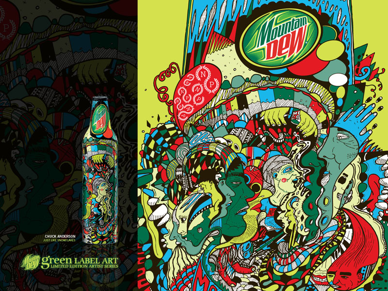
Chuck Anderson, “Just Like Snowflakes”
“My bottle illustration was inspired by the highs and lows everyone goes through during the course of a regular day, with the intense colors intended to bring fun and life to an otherwise chaotic and confusing world.”Chuck Anderson (Chicago, IL)
Chuck's creative approach is just as appealing to Dew as his artwork for this project. “Almost everything I do is unscripted,” he explains. “there are rarely mock ups or pencil drawings or sketches. I get my hands dirty right away. I just get right into it.” Chuck's style ranges from surrealistic kaleidoscopic skyscapes to ornate, handcrafted illustrations. Chuck boasts an impressive client list including Triple Five Soul and Nylon, as well as Lupe Fiasco's album cover.
JT Woodruff with Hawthorne Heights, “Umbrellas”
“The umbrella signifies our band shielding us from the adversity we've been dealing with. The tulips signify renewal and hope.”J.T. Woodruff (Dayton, OH)
In a matter of two years after forming, Hawthorne Heights staked their claim as a leader of the new rock scene. Their debut album is marching toward platinum, driven by the band's non-stop touring schedule, Dew has been an active supporter of Hawthorne Heights since 2004, when they first appeared in the “Dew Circuit Breakout” show on MTV2. Dew was surprised to learn recently that lead singer JT Woodruff is also a conceptual artist, and immediately asked him to be a part of the Green Label Art project. JT likes irregularities in art — “Art is not perfect,” he says, “Just as I am not.”

Volume I, 2008
Chuck Anderson, “Just Like Snowflakes”Re-Issue
“My bottle is inspired by the highs and lows everyone goes through during the course of a day. The intense colors bring fun and life to an otherwise chaotic and confusing world.”Chuck Anderson (Chicago, IL)
For DEW, Chuck's creative approach is as appealing as his artwork is for this project. Known for his unscripted, free style, Chuck is never afraid to jump right into his work. His repertoire ranges from surrealistic kaleidoscopic skyscapes to ornate, handcrafted illustrations. Chuck's impressive portfolio includes work for Triple Five Soul and Nylon magazine, as well as Lupe Fiasco's Grammy nominated debut album.
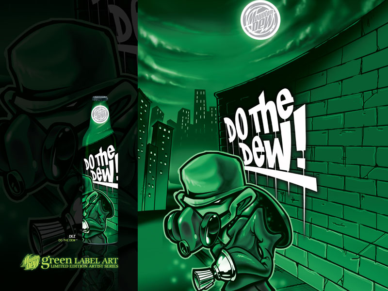
DEZ, “Do the Dew”
“DEW is about excitement and adventure. That time when everyone is asleep and your adrenaline levels are at their peak. Your pounding heart fills the night's sound void. Everything is green for your eyes, like night vision. You've got a wall to paint — you must complete your mission.”DEZ (Houston, TX)
DEW is proud to introduce the world to Dez's animated lines and brilliant colors. He rose to the top of the 2007 Green Label Art design contest, competing against thousands of artists and designers for a spot on this year's roster. Honing his style through involvement in his local hip hop scene, Dez is known for his work on everything from walls to T-shirts, sneakers and furniture. He has explored graffiti's application through airbrush, old school caps and the computer. Now he can add one more canvas to his list: our aluminum bottles.
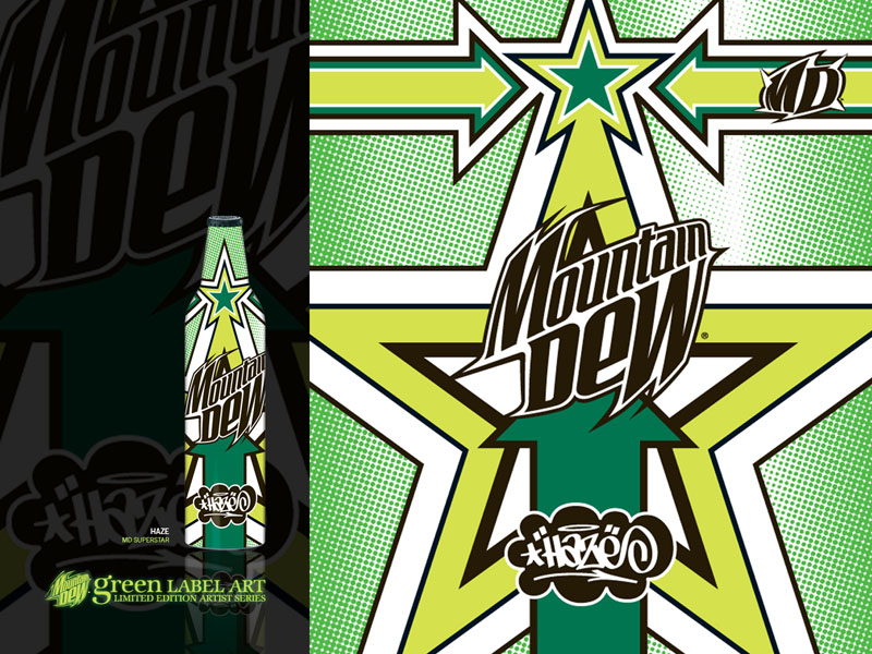
Haze, “MD Superstar”
“I wanted my bottle to jump off the shelves with a super vibrant, pop art kind of vibe. I've always liked Dew since I was a kid so I also wanted the design to feel somewhat timeless while still being current. It's cool getting a chance to put my stamp on a true piece of Americana.”Haze (New York, NY)
Eric Haze has been making an impact for over 30 years with creative influence in the worlds of art, product design and graphics. After spending the '70s and '80s on the front lines of the NYC graffiti movement, Haze opened his design studio in '86 and went on to design classic logos for The Beastie Boys, LL Cool J, Public Enemy, MTV and many more. These days Haze remains world renowned for his graphics and fine art work, as well as his trailblazing streetwear clothing brand.
Peat Wollaeger, “Bill Hilly”Re-Issue
“My inspiration came from too much exposure to spray paint fumes and a vintage bottle of MOUNTAIN DEW.“Peat Wollaeger (St. Louis, MI)
Internationally known for his whimsical, raw and brightly colored stenciled characters, Peat started doing urban-influenced designs in the early '90s. Inspired by guerilla artist Banksy, he began using stencils and spray paint to reproduce his graphics. It quickly became his medium of choice. DEW became interested in Peat after seeing his imaginative viral videos where he portrays his stencil characters in costume. Peat is currently preparing a body of work for an exhibition in Melbourne. Check out Peat's video rendition of the retro DEW character “Bill Hilly” at stencilbilly.com.
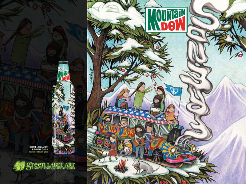
Scott Lenhardt & Danny Davis, “Reflections of Dew”
“Collaborating with Danny on the bottle was like hanging out with a friend I hadn't seen in a while, even though we'd never met. We seemed to be on the exact same page, so coming up with an idea was easy.”Scott Lenhardt & Danny Davis (New York, NY)
With the design of over 45 Burton snowboard graphics under his belt, Scott was a natural collaborator for DEW snowboarder Danny Davis. Scott brings 10 years of commercial and fine art experience, including designs for Nike, while Danny brings his explosive amplitude and contagious energy. Scott's natural minded style easily fused with Danny's active outdoor lifestyle, resulting in an organic bottle design collaboration.
Troy Denning, “Concrete Dragon”Re-Issue
“I wanted my bottle to look like a magic elixir from a samurai's pouch. Something to get him through battle.”Troy Denning (New York, NY)
Having studied extensively in Europe and Japan, Troy Denning has learned from the best in the industry. With 18 solid years of tattooing experience under his belt, his undeniable passion for his work and for the craft of tattooing is evident in his vibrant and crisp style that pays respect to the Japanese irezumi. His impressive portfolio and his support of New York's tattoo and contemporary art communities led DEW to Troy and his fusion studio and gallery, Invisible NYC.
Pushead, “The Course Marker”Chase Bottle
“The difficult track is lined with course markers; the type that the individual will try, but only a few can ever pass. Boundaries that push the individual with all their might. In the distance is the finish line, a beautiful butterfly right after metamorphosis. The metamorphosis of successfully finishing the path of the course markers. This beauty represents success and Mountain Dew quenches that success.”Pushead (San Francisco, CA)
A graphic artist and illustrator rooted in the underground, Pushead recently celebrated the 25th anniversary of this nomme de plume. From his roots in Boise to the double decade homestand in San Francisco, he's created iconic symbols like Metallica's “Damaged Skull,” The Misfits' “Evileye” and The Exploited's “Mohican Skull.” From hardcore to metal, he's designed merch and covers for the likes of Motley Crue, Corrosion of Conformity, Rush, Prong, SSDecontrol, Ministry, Rattus, Cocobat, Kylesa, and even the infamous Dr. Octagon cover, to name only a few. A widely recognized part of the skateboard world, with graphics for Zorlac, Thrasher, Zero, Conspiracy, Real, and more. Somehwere, somehow, a Pushead piece has surely passed your way… before this exclusive bottle.
Volume II, 2008
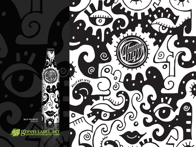
Billy the Artist, “Open Eyes”
“My bottle's name follows my artistic philosophy. Don't just look forward, but keep your eyes open and see what opportunities are around you. It's as simple as black and white. DEW is all about being free; enjoying the exciting things that life can give you, and keeping your eyes open.“Billy The Artist (New York, NY)
Billy the Artist lives by his mantra of “create your own reality.” Capturing the energy of the city around him, Billy's created his own style called “urban primitive,” a kaleidoscope of puzzle-like images that captured DEW's attention immediately. Billy has participated in everything from Art Basel Miami and art openings around the country to creating art for everyone from Suzuki to the Woodstock '99 Festival.
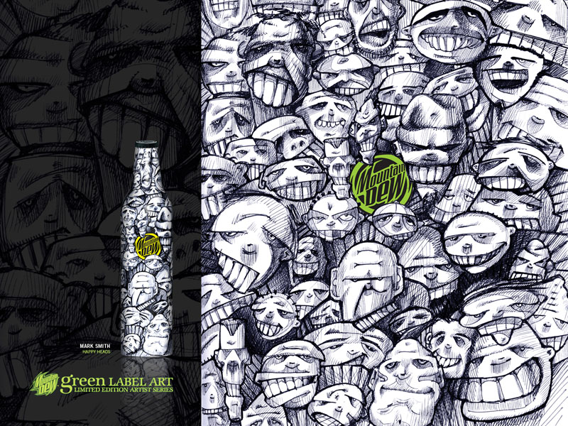
Mark Smith, “Happy Heads”
“We are all unique individuals, yet we gather in tribes, families of commonality. We have the same bits and pieces. We sit alone in the dark together watching movies and laugh and cry at the same time. We are me. Sometimes it's hard to tell where you begin and I end.”Mark Smith (Portland, OR)
Skilled in multiple disciplines from concept imaging to custom graphics, Mark Smith blends art and commerce on a daily basis as Creative Director at Jordan Brand. At night he spends his time as a curious artist, exploring storytelling through everything from paint to print to sculpture to music; dedication that DEW admires. In addition to typically showing his work twice a year, Smith is currently working on a book and producing a film.
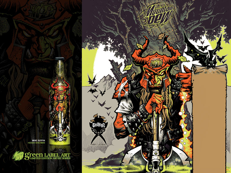
Mike Sutfin, “Hessian Henchman”
“The Hessian Henchman waits patiently at the summit of the sacred mountain, blasting heavy metal in the moonlight while carving oak with sharp steel. At dawn, a mysterious mist forms, and the Hessian captures the lime green potion. Drink it and feel the might of a thousand wolves.”Mike Sutfin (Emeryville, CA)
With roots in music, skateboarding and fantasy, Sutfin paints what he loves. In '96, he began a career in gaming, working on Dungeons & Dragons, Magic: The Gathering and World of Warcraft. By '01 he had created illustrations for Star Wars and Dark Horse comics. After moving to California, Sutfin created graphics for skate brands like DC and Foundation. He is known for his precise attention to detail, dynamic compositions, veggie fajitas recipe and an iron-fisted work ethic.
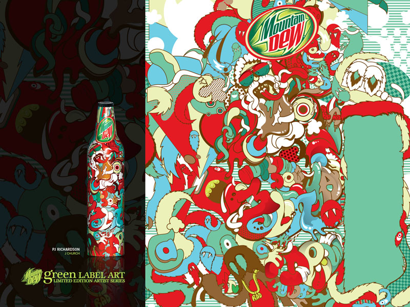
PJ Richardson, “J Church”
“I took inspirations from time spent in Washington DC where friends exposed me to Go-go music. Essentially, the premise of Go-go is to shout out everyone you know, and so I used the bottle canvas to shout out friends, DEW and everything else in between.”PJ Richardson (Los Angeles, CA)
A true California native, PJ was born in SoCal and grew up in downtown San Francisco, where his affinity for graf and letter forms was born. He spent his earliest years beautifying the local Muni transit system, before a show at a local museum catapulted PJ into the world of fine art. Studied in illustration and computer animation, PJ went on to develop his repertoire of logo, music video and illustration work at his design studio Laundry! which is where DEW found out about his unique style. LAUNDRYMAT.TV
MAZE, “Dew Celebration”
“I was inspired by my trip to Brazil for carnival. I wanted to evoke that feeling of celebration, as my way of celebrating the DEW within us all. There was a sense of passion and fire that I felt in Rio that I translated using new school and old school graf elements.”Stephan “Maze” Georges (Brooklyn, NY)
MAZE started sewing at the age of ten and hasn't stopped since. As a teenager, he got sucked into the world of graffiti and quickly began making a name for himself in the game. His early street art experiences continue to inspire his clothing design, allowing him to create urban sportswear with a functional edge. When not designing, MAZE surfs, snowboards, skates and rides fixed gear bikes, hobbies that DEW can appreciate.

Troy Denning, “Fearless Fury”
“The mist represents the calmness while the tiger represents raw power and majesty in reserve, a theme often reflected in my work.”Troy Denning (New York, NY)
Having studied extensively in Europe and Japan, Troy Denning has learned from the best in the industry. With 18 solid years of tattooing experience under his belt, his undeniable passion for his work and for the craft of tattooing is evident in his vibrant and crisp style that pays respect to the Japanese irezumi. His impressive portfolio and his support of New York's tattoo and contemporary art communities led DEW to Troy and his fusion studio and gallery, Invisible NYC.

Volume III, 2009
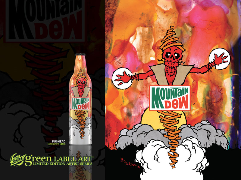
Pushead, “ScareCrow Genie”
“The course passes a desert oasis. The rising heat fabricates vapors of illusion; and then as billowy clouds start to form from the sand, a tall menacing shape appears. Stiff, yet lifelike, with arms outstretched, the ScareCrow Genie wards off those who trespass, yet grants the wish of thirst to those in need. The power from the ScareCrow Genie's hands rains Mountain Dew over the dry parched lips of the racer's mouth. Quenched, the race continues…”Pushead (San Francisco, CA)
Hailing from San Francisco, Pushead, is a self-described “underground renaissance man” whose signature punk-influenced artwork has appeared on skateboards, sneakers, vinyl toys, clothing, posters and record sleeves for renowned bands like Metallica and The Misfits. A published writer and regular contributor to the unofficial Bible of skateboarding, Thrasher Magazine, he also owns two indie-record labels, Pusmort and Bacteria Sour.
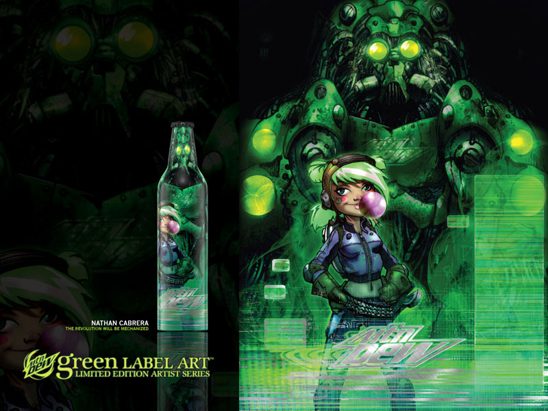
Nathan Cabrera, “The Revolution Will be Mechanized”
“I've always loved the idea of young kids building bruiting robot sidekicks. The image pays homage to modern science fiction, kid think and empowering youth with the idea that they can make anything no matter the size or complexity. Who's going to pick on you with a two-ton robot at your side?”Nathan Cabrera (Los Angeles, CA)
The self-taught Nathan Cabrera is a versatile LA-based artist who moves effortlessly between sculpting, painting, vinyl toys, computers, fashion, television and print. His work has been featured in galleries worldwide and graced the covers of Juxtapoz, Flaunt and Arkitip. He got his start producing and coloring graphic novels for DC and Marvel Comics. He has also worked with Converse, Nike, Levi's, Maharishi, HUF and other respected lifestyle brands.
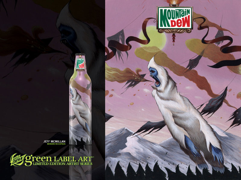
Jeff McMillan, “Beware Mountain”
“My Yeti design is inspired by three characters: The Wampa from Empire Strikes Back, Snow Monster in the Matterhorn at Disneyland and The Abominable snow man from the claymation Christmas special Rudolph the Red Nose Reindeer.”Jeff McMillan (Long Beach, CA)
A California native residing in Long Beach, Jeff McMillan studied illustration at the Academy of Art in San Francisco and the prestigious Art Center College of Design in Pasadena. His intricate, detailed artwork is heavily influenced by '80s pop culture. Jeff also has the distinct honor of being a featured blogger on Slamxhype - a top lifestyle website that is read in over 130 countries.
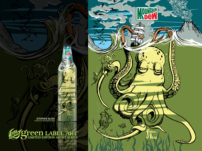
Stephen Bliss, “Ocean of Mountain Dew”
“I imagined there to be a world inside every bottle of MD — an adventure — a huge ocean of Dew with sea creatures. The scene is frozen, on the brink of chaos; the ship is about to be pulled under the ocean and the volcano will erupt. The birds are scattering in anticipation. A different adventure lives in every bottle.”Stephen Bliss (New York, NY)
Stephen Bliss is based in NYC where he serves as the Senior Artist at Rockstar Games. He is responsible for painting and designing packaging, magazine covers, posters and billboards for the wildly successful Grand Theft Auto series. Over the years, his sublime illustration abilities have been tapped by a range of top brands including Sony, Nintendo, Pepsi, MTV and Burton, as well as GQ, Sunday Times, ID and Time Magazine.
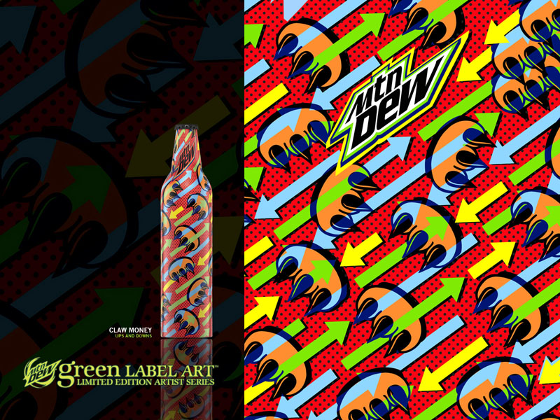
Claw Money, “Ups and Downs”
“I use the soda's effervescent flavor as my inspiration for the art. My use of color and imagery is both boisterous and vociferous. Trying to illustrate the indisputable, lip smacking uniqueness that is both Claw Money and Mountain Dew.”Claw Money (New York, NY)
Claw Money is recognized the world-over for her signature “paw with three claws” icon. With deep roots in the New York graffiti scene, her namesake clothing and accessories line has garnered a strong celebrity following from the likes of MIA, Cameron Diaz, Kanye West, Pete Wentz, and more. Major brands including Nike, Boost Mobile, Calvin Klein, K2 and The Gap have signed her up for exclusive collaborations.
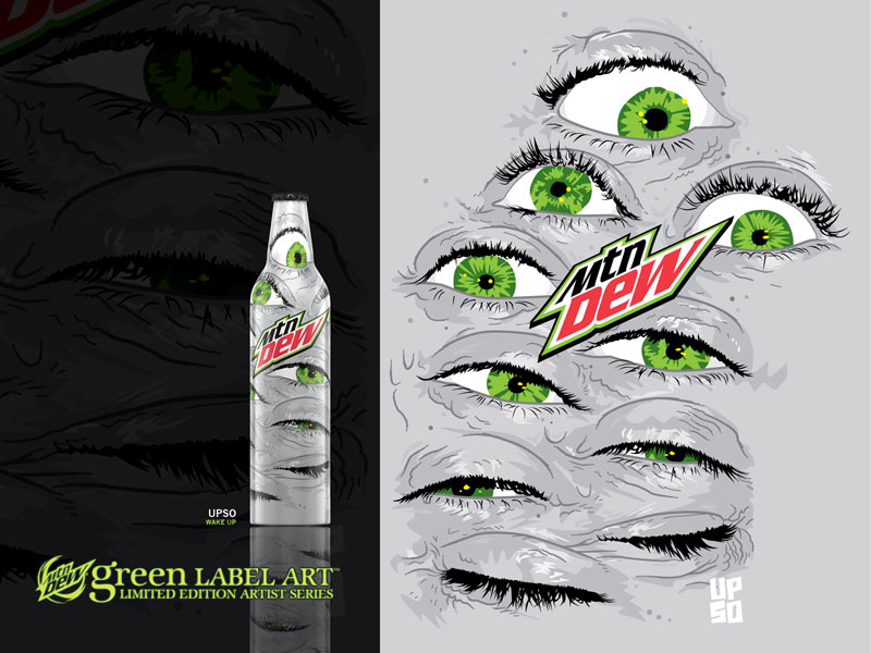
UPSO, “Wake Up”
“The illustration on this bottle represents not only what it feels like to first chug some Mountain Dew but also the reaction one might have upon first seeing this unique design and packaging.”UPSO (Toledo, OH)
UPSO is a Toledo, OH-based graphic artist, curator and publisher.He has worked with brands such as Kid Robot, MTV and Converse, and his artwork has been displayed in magazines, books and on gallery walls around the world. Since 2001, he has published the critically-acclaimed art magazine, Faesthetic, and has worked as a curator for companies like Threadless and Scion. UPSO.ORG
Evan Coburn, “Circle of 8”Chase Bottle
“The label design is meant to create a playful sense of mystery. Using some of my favorite scientific elements, I encoded the bottle with all kinds of hidden information. The lettering brings it all into focus…”Evan Coburn (Los Angeles, CA)
Evan Coburn is a Los Angeles based artist who has studied fine art in both Europe and Southeast Asia. A former chemistry student, Evan strives to express the human element that exists outside of time. He combines a blend of modern day alchemical symbols with a variety of graphic elements to create images that explore the mystery of life. Evan's work asks a simple question. What is it that takes a handful of chemicals and gives it life? With a strong sense of composition and a unique approach to image manipulation, Evan's work explodes with vibrant colors and a dynamic uplifting sense of style.